Why Color?
© Gary Doyle Thomas Primary Focus Photography 2013
Color has existed since the first moments of the Big Bang, colors far beyond our feeble ability to perceive. What is a color except an energetic particle or wave striking a receptor? It was left for God and evolution to design the receptors. Estimates for how many colors the human eye can see span across a huge range, no one really knows. The member of the animal kingdom with the best color vision is the butterfly. With six different receptors the butterfly can see colors we have no names for.
We are surrounded by color from the second we are born. Does a baby know red from blue? Of course not but they do see there is a difference. Like tastes and smells, color is ostensive, it can not be defined only demonstrated. As we grow and learn we create associations between the colors we see and what they mean. What child has not played the game “Red Light – Green Light” or eaten an orange? What is your favorite color is a common question.
Color Affects Taste and Smell. This pertains to the condition known as synaesthesia. This condition describes how our senses work together. For example – with respect to sight, taste and smell – seeing a color may evoke any number of other sensations. Green may be evocative of the smell of grass, lemon yellow may evoke a sour taste.
Black is the color of death in the western world while in the east it is white. Black and white are the first colors (or non-colors if you will) to be given names.
The more associations we make, the more complex color becomes. The meaning of color comes into play and your environment defines the meaning. Color is active and compels us to be reactive. Some are universally common, in most cultures red is the first color given a name and is associated with fire, blood, danger, Communism, love, good luck, and passion. It can be red tape, red barn, red light both stop and prostitution, red head, red herring, red faced, red state, red handed, and so on. Most national flags across the world contain some red. On the other hand, most ancient languages had no word for blue. If a color can have so many meanings can it have any meaning? Yes, but only if there are other clues to spark the visual memory. Color associations represent a loss of innocence.
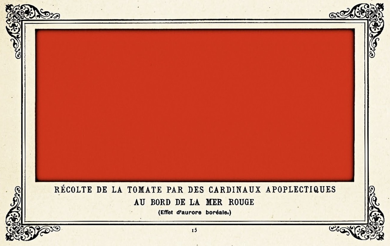
Have we all seen and heard about the Painting “Cows Eating Grass In Snowy Field?” a blank white canvas. Where is the grass? Well the cows ate it. Ok, so where are the cows? After the cows ate the grass they left. More seriously is Alphonse Allais’s Painting of a red rectangle titled “Apoplectic Cardinals Harvesting Tomatoes by the Red Sea”.
Shannon’s sampling theorem (sample frequency=2* max frequency) states that a minimum of two samples are required to acquire information from data. In color science this is called simultaneous contrast. Colors adjacent to each other impact how each of the colors is perceived. The objects being examined also impact the colors perceived. Even in a black & white environment color is implied. One theory about what makes objects appear the color they are has to do with the size and angle of the exposed facet of the structure at a molecular level.
Be careful not to take this connection too far, however. In particular, there is more to color than a single frequency. For instance, light could be hitting your eye with two overlaid wavelengths – one of which resonates with the green receptor very well, and the other of which resonates particularly well with the blue. The resulting perception is likely to be a teal that simply cannot be reproduced with a single wavelength. This is exactly analogous to sound, where a monochromatic “pure” pitch will never, at any frequency, sound like a trumpet or a viola – those instruments’ timbres are defined by the varying strengths of the overtones. In other words, “all the colors of the rainbow” does not encompass all colors.
Browns, including flesh tones, tend to be the most difficult. We all see flesh tones everyday and they are well embedded in our visual memory.
The other point is that there are valid combinations of receptor stimulation levels that cannot be achieved by any combination of wavelengths. This is partly due to how your receptors’ ranges are not separate. Note for instance how you can never, for example, get “100% green, 0% red and blue” as a signal from your eye to your brain. Such theoretical colors that cannot be reproduced with any source of light are called imaginary colors. Supposedly, you can actually see some imaginary colors by first saturating one or more receptors (say by looking at nothing but lots of pure green for a few minutes), thus wearing them out, and then looking at another source of light. The response you get won’t be quite the same as you normally would with that light source.
It has been said that Photography is about light but that is not really true. Photography is about seeing. The largest single portion of the brain is dedicated to the visual cortex. We recognize objects by their edges, where there is a change in contrast creating a shape. This is why black & white Photography is possible. An additional clue to what we see is color and from its early days Photographers wished to reproduce colors.
Reaction to color in a Print can come from individual or average color. The point being that color creates a mood consciously or not. What is a south seas beach or a sunset without the presence of color? Location and time of day both change the pallet and the resulting feeling.
How does what we perceive as our favorite colors affect our feeling? Why do some color pallets have more appeal than others? What we define as the “cool, calm” colors such as blues and cyan’s are actually at the high energy end of the spectrum while the “warm, active” colors like red and orange are at the low end with greens in the center. We can detect when the color does not look right.
Nether color nor black & white Photography need to be defended. Their are those who feel differently. Color is not an addition but black & white is a removal. Removing color information changes but does not destroy the intent of a Photograph. In the past black & white was a necessity. Today, it is an alternative.
© Gary Doyle Thomas Primary Focus Photography 2013